Sunday, February 05, 2006
Review: Not quite feeling it.
Do you like this story?
"Touch"
paintings by Jason Zickler
at 4 Star Gallery
I feel it is best that I let it stand that, though I was familiar with who Jason was, I was unfamiliar with what his work looked like. Aside from knowing he made abstract paintings, my memory was unable to put a name to the works I may have seen in group shows around town. (I later recognized that I had indeed seen a piece or two at one point.) I bring this up for the fact that when I first heard the title of his show, "Touch", I immediately formed preconceived expectations and some doubts as to how a painting show was going to deal with the concept of touch. Was the show to be about the artists personal, tactile relationship with the paintings? Was it about the viewers experience of touching the works themselves? Was it about the idea of the paintings connecting with the viewers, as in "to be touched" by the art? These were the things going on in my head before I ever set foot in the gallery. For better or for worst, this is what I came into the show wanting to find out.
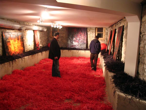
immediately upon entering the gallery I found myself treading through a pile of dark shredded paper covering the entirety of the gallery floor. This addition to the exhibition is lost upon me. Was this all an homage to the Paul Harris and Michael Begley show at Ruschman Art Gallery last November? The longer I stayed in the gallery, walking around from painting to painting, the more I found myself just annoyed by the shredded paper. All the paper did for me was make me constantly aware of the floor and less aware of the paintings.
The gallery was filled with paintings of all sizes and formats in shades of brilliant reds, oranges, and blacks. The best paintings in the show played with the luminosity of those rich reds, the glow... The works were built up in large crusty surfaces. Painterly strokes of impasto paint. This is the type of thing I am often drawn to in a work, but all the paintings were mere inches apart from each other, crowding each other to the point that it hurt the viewing experience. For paintings of this nature, they need some space to breath. A space free of other visual distractions so the viewer can truly see the work, be able to experience the work. And one of the main gallery walls had been painted a deep Burgundy color, which, in my opinion, made the already dark paintings recede into the wall. Hiding them.
This is not to say that the paintings in the show had nothing going for them. On the contrary. I found some of the paintings to be quite engaging. The painting that stood out to me the most, the best of the show, was a large canvas titled, "Twenty 8". This painting used the same colors but instead of the painterly, lush application of paint, each area appeared to be defined by painted cloth attached to the surface of the painting. Each piece of cloth became the stroke of color. This painting made me want to see more of his work, but preferably in a more sparse setting.
After my initial walk through of the show, I started to think again about how this show dealt with touch. I listened as couples chatted amongst themselves, "are we supposed to touch them?" As I watched, no-one was touching the work. I, myself, was unaware whether I was supposed to touch them. One gentleman asked if there was an artist statement he could read. Perhaps that would shed some light on the matter. There was no artist statement to be read. Is the show about touching the work? If so, why even play with other visual formal issues like color, composition, and luminosity? Why not go mononchrome? Why just one type of paint? Why not other materials like fur, sandpaper, or silk? If it is about touch then why not exploit it more? These were the things I was asking myself. I was reminded of a show I read about at the V&A called "touch me" as well as other shows recently popping up catered to the visually impaired.
I left the show disappointed in the overall experience as a cohesive exhibition. And while sitting down to write this review (Note: that this is now the second time I am writing this as the first attempt disappeared into the depths of cyberspace after 2 hours of typing do to some bug.) I came across his artist statement on the 4 Star Gallery website. Now, I could get a better understanding of what he was going for. Now, I want to make it clear that I rarely feel the need to read an artist statement, as I find that artists are often the worst people to write there own statement. After all, we are not "writers". But in the rare case that I feel that I may be missing something, a key to the artists thinking, I find an artist statement to have purpose. So, in his own words, "Much in the same way we use Informatics to analyze the relationship of humans and information technology; in my art I am deconstructing the relationship between people and art by studying the basic elements of design such as shape, color, texture, value and size." I keep rereading this. "Deconstructing the relationship between people and art"? If he was talking about doing this by making people aware of the floor of the gallery more or through the act of allowing people to touch the art works, then I may buy this statement. But, it is the second half of this statement where he says he is doing this through "shape, color, texture, value and size". I don't think that the paintings in this manner are dealing with the relationship between people and art. Perhaps I am just interpreting this statement in the wrong context.
I know this comes off as a harsh critique of the exhibition and it is not my intention to offend or to say that I am right in my opinions. But, I do feel that for art and artist to grow, to become better, we must come face to face with honest criticism. To take from it what we may, and move forward. As I stated in my opening paragraph, I came into the show with my own preconceived concerns and doubts, which may have swayed my view. I commend Jason for attempting to deal with an aspect of art many people never consider as well as one which I feel is hard to pull off. In my opinion this attempt faltered. But in the art world we all have hits and misses. If we are not willing to fail, then we shouldn't be playing. Perhaps someone out there can convince me that I was wrong about aspects of this show. I am open to that possibility. All in all, the I suggest you check out the show for yourselves and I look forward to see what he will do next.
For a more positive take of the show, check out this write up and interview with Jason from Intake.


4 Responses to “Review: Not quite feeling it.”
February 5, 2006 at 9:47 AM
Thanks for taking the time to put it up on the blog...twice.
Quincy
February 6, 2006 at 12:37 PM
I agree with your harsh critique. There is too much going on. The dark walls, no way, the show needs a curator. The artist seems to be doing way to much, color of walls and paper graffiti.
Let the paintings speak for themselves. I like the colors and patterns and do not care to get bogged down in infographics and its relation to people.
February 7, 2006 at 12:06 AM
Bloody bowel movements, Batman!
Or as Merriam-Webster would put it:
An intensive act, sometimes vulgar from the seat of pity, tenderness, or courage involving the process of moving; especially: a change of place position or posture... Batman!
POW! BAM# KAPOW%
Please stop painting, the mess Spud made in Trainspotting... or I am going to get sick and create and accidental masterpiece!
February 8, 2006 at 1:05 AM
that was a well crafted and insightful blog post there, scott - nice one. got a bit lost on the apologies, but I can stomach them from time to time.
Post a Comment